Wednesday, August 22, 2007
Sunday, August 5, 2007
Monday, July 9, 2007
Broadway Boogie Woogie is a Mondrian's description of
Colors: red, blue, yellow, white, and black.
Composition: symmetrical and grid-like structure, straight lines forming 90-degree angles.
Shapes: squares and rectangles.
Mondrian used straight lines to outline the streets. He colored the streets in yellow, allowing the viewers’ eyes to travel easily along the streets. In and around the intersections, darker squares are inserted to heavily contrast the bright yellow lines. When the eyes reach the dark colors, they stop in a short moment then continue along the yellow streets. By using color contrast, he gave the viewers the impression of the stop-and-go movement in
In addition, by using the colors, Mondrian also manipulated space. He used the dark and light colors to give the painting a bit of a 3D-sense. He used the brighter colors of yellow and red to give the impression of rising buildings and used the dark shades of blue to show the depth of the city details.
Besides, another aspect of the city that the color contrast portrays is the hustle and bustle of the big city
Outside of the lines is negative space. Mondrian used the negative space to balance the colors in the positive space and prevent it from being solid color and being harsh in the viewers’ eyes.
Let's enjoy some unbelievable miracle of color.
from Visual Sound...
Conflicted between a career in music and painting, Klee, a trained violinist, eventually chose painting. So music had a special influence on him. He made use of visual musical notes to "draw" his artworks. He believed that music could be translated quite directly into gradations of color and value, repetitions and changes of motif.
 He made use of visual polyphony to "compose" many paintings, such as Plant Growth. Here he takes several shapes - equivalent to musical thematic material—such as circles, squares, and ovals, and develops them through intricate layers, in various sizes, colors, and placements. His composition of stacked forms here looks like decks of cards or color swatches, are attempts to freeze time in a static composition, to give visual feeling of lovely melodies.
 One of the most abstract paintings, the wonderfully titled Ancient Sound, is composed of rough but precise squares of color, gray-green, earth-dark and black near the edges, jade, orange, vanilla and pale yellow at the center, all tilting very slightly to the right. For most of us, clear and bright colors make us think of high sounds, while dark images suggest low sounds. And like above, the composition of shapes and colors in this painting also is used to inform viewers of sound.
Sunday, July 1, 2007
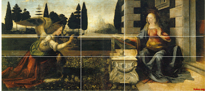
The Annunciation
The Mona Lisa
1. The Annunciation - Draw in a horizontal line that is 61.8% of the way down the painting (0.618 - the inverse of the golden ratio). Draw another line that is 61.8% of the way up the painting. Try again with vertical lines that are 61.8% of the way across both from left to right and from right to left. So now we have four lines drawn across the painting. Notice that these lines intersect important parts of the painting, such as the angel, the woman, the trees, etc.
2. The Mona Lisa - Measure the length and the width of the painting itself. The ratio is, of course, golden. Draw a rectangle around Mona's face (from the top of the forehead to the base of the chin, and from left cheek to right cheek) and notice that this, too, is a golden rectangle.
3.

Leonardo da Vinci's talent as an artist may well have been outweighed by his talents as a mathematician. He incorporated geometry into many of his paintings, with the golden ratio being just one of his many mathematical tools. Why do you think he used it so much? Experts agree that he probably thought that golden measurements made his paintings more attractive. Maybe he was just a little too obsessed with perfection. However, he was not the only one to use golden properties in his work.
Saturday, June 30, 2007
Firstly I’m gonna show you how to draw a golden rectangle:
Since the Renaissance, many artists and architects have proportioned their works to approximate the golden ratio—especially in the form of the golden rectangle, in which the ratio of the longer side to the shorter is the golden ratio ( φ = 1.618 ) — believing this proportion to be aesthetically pleasing.
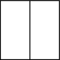
1. Construct a square
2. Then bisect the square
3. Draw a line from one end of the bisecting line to one of the opposite corners. Extend the baseline of the square
4. Using the diagonal line as the radius, drop an arc from the corner of the square down to the baseline

5. Draw a line from the point of intersection of the arc and the baseline, perpendicular to the baseline. Extend the top edge of the square to meet this line and form a rectangle

This rectangle is referred to as the golden rectangle

 This is the Parthenon temple in


